Grid
Grid-Three
Grid with 3 columns and turn into flex in mobile.
Has grid-gap 2em.
Add grid-gap-1 or grid-gap-0 to override to 1em column spacing.

<div class="grid-three grid-gap-1">...</div>
<div class="section ">
      <div class="container container-fluid py-4">
        <div class="grid-three grid-gap-1">
          <div class="has-shadow is-rounded">
            <tu-img
              img="images/lashes/atikh-bana-zPFws4toKhg-unsplash.jpg"
              :height="75"
              position="object-position-top"
            ></tu-img>
          </div>
          <div class="has-shadow">
            <tu-img img="images/lashes/hayley-kim-design-sRSRuxkOuzI-unsplash.jpg" :height="75"></tu-img>
          </div>
          <div class="has-shadow">
            <tu-img img="images/lashes/semen-zhuravlev-UtSk30R6i5c-unsplash.jpg" :height="75"></tu-img>
          </div>
        </div>
      </div>
    </div>
Grid-Half (Side by Side)
Use grid-half to make a card with two sides equally.
This one don't have a gap.
<div class="grid-half">...</div>
<!-- Section -->
<div class="section ">
<div class="container container-fluid py-4">
<div class="row">
<div class="col">
<card-half-image
img="images/lashes/alexander-krivitskiy-PoogTvXLv8U-unsplash.jpg"
position="object-position-top"
>
<!-- Slot for content -->
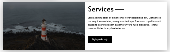
<div class="title accent-line-right jumbo mb-4">Services</div>
<p>Lorem ipsum dolor sit amet consectetur adipisicing elit. Distinctio a qui sequi, consectetur, numquam similique facere ea cupiditate nisi expedita exercitationem aspernatur vero nulla blanditiis. Tenetur dolores distinctio explicabo facere.</p>
<div class="py-4">
<a href="/styleguide" class="btn color-bg-black">
Styleguide
<span class="link-icon">
<svg
viewBox="0 0 15 15"
fill="none"
xmlns="http://www.w3.org/2000/svg"
width="24"
height="24"
>
<path d="M13.5 7.5l-4-4m4 4l-4 4m4-4H1" stroke="currentColor" />
</svg>
</span>
</a>
</div>
<!-- End for content -->
</card-half-image>
</div>
</div>
</div>
</div>
<!-- End -->
Three Cards with Borders
<div class="section">
<div class="container container-fluid">
<div class="row">
<div class="col py-4 grid-item-center">
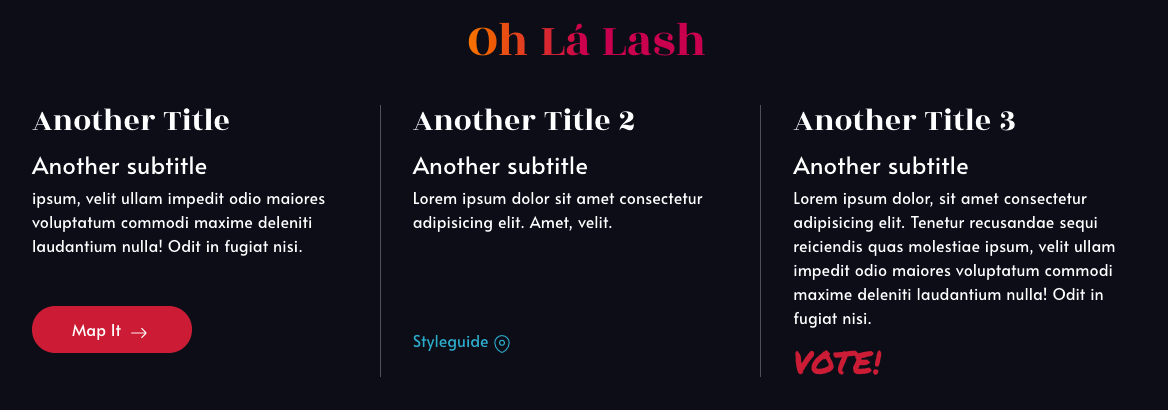
<div class="title jumbo font-rozha mt-4 gradient-text">Oh Lá Lash</div>
<div class="spacer"></div>
<!-- Grid 3 Cols -->
<div class="grid-three">
<div class="hello-card border-right">
<div>
<div class="title font-rozha mb-3">Another Title</div>
<div class="sub-title mb-2">Another subtitle</div>
<p>ipsum, velit ullam impedit odio maiores voluptatum commodi maxime deleniti laudantium nulla! Odit in fugiat nisi.</p>
</div>
<div class="my-4">
<a href="/styleguide" class="btn color-bg-red btn-round color-white">
Map It
<span class="link-icon">
<svg
viewBox="0 0 15 15"
fill="none"
xmlns="http://www.w3.org/2000/svg"
width="18"
height="18"
>
<path d="M13.5 7.5l-4-4m4 4l-4 4m4-4H1" stroke="currentColor" />
</svg>
</span>
</a>
</div>
</div>
<div class="hello-card border-right">
<div>
<div class="title font-rozha mb-3">Another Title 2</div>
<div class="sub-title mb-2">Another subtitle</div>
<p>Lorem ipsum dolor sit amet consectetur adipisicing elit. Amet, velit.</p>
</div>
<div class="my-4">
<a href="/styleguide" class="cta">
Styleguide
<span class="link-icon">
<svg
viewBox="0 0 15 15"
fill="none"
xmlns="http://www.w3.org/2000/svg"
width="18"
height="18"
>
<path
clip-rule="evenodd"
d="M7.5 8.495a2 2 0 002-1.999 2 2 0 00-4 0 2 2 0 002 1.999z"
stroke="currentColor"
stroke-linecap="square"
/>
<path
clip-rule="evenodd"
d="M13.5 6.496c0 4.997-5 7.995-6 7.995s-6-2.998-6-7.995A5.999 5.999 0 017.5.5c3.313 0 6 2.685 6 5.996z"
stroke="currentColor"
stroke-linecap="square"
/>
</svg>
</span>
</a>
</div>
</div>
<div class="hello-card">
<div>
<div class="title font-rozha mb-3">Another Title 3</div>
<div class="sub-title mb-2">Another subtitle</div>
<p>Lorem ipsum dolor, sit amet consectetur adipisicing elit. Tenetur recusandae sequi reiciendis quas molestiae ipsum, velit ullam impedit odio maiores voluptatum commodi maxime deleniti laudantium nulla! Odit in fugiat nisi.</p>
<div class="title font-marker color-red">VOTE!</div>
</div>
</div>
</div>
</div>
</div>
</div>
</div>